We have created a variety of different merchandise to go alongside our album because we think that this is a very important part in the sale of an artist. We researched the merchandise of similar artists and common products included mugs, tshirts, hoodies, wristbands and hats so these are the products we decided to create for our artist. We also decided to create pillows because of the themes that run mainly in our digipak and advert but also in parts of our video of the pillow fight and having fun.
Above are examples of merchandise from Jess Glynne and Ella Eyre who are similar to the artist that we wanted to create through Sasha. It was interesting to look at Ella Eyre's merchandise because she is the singer from the song we chose so it was interesting to see the differences and similarities between herself and our artist. The merchandise for both of the artists was mainly black and white and they both included snapbacks and T-shirts however Ella Eyre had a much wider variety of merchandise. The merchandise were all related to the trademarks of the artist and their albums. Jess Glynne's merchandise featured the name of her most recent album "I cry when I laugh' and Ella Eyre's featured the logo from hers.
For the both of the mugs I used the name of our artist in the fonts used for our digipak and advert. This was to create synergy between the products and to identify the mug to our artist. One one mug I used the image of wings which is used on our digipak and represents our artist as innocent and angelic. On the second mug I used the logo from the front cover of our digipak to directly link them together and make the logo recognisable to the audience.
We decided that our artist would have 2 pillows, for one we used the image of our artist and her friend having a pillow fight with the 3D filter. This also directly links to the digipak and advert in which we have used this picture. It is also a product that our target audience would be interested in because it is stylish and represents our artist well. The second pillow is much more simple with the logo of our digipak presented simply with the name of our artist. This also represents the digipak and so also creates synergy, it shows the more simple, calm and elegant side of our artist and having this and the first pillow will show the two sides of her and appeal to a wider market.
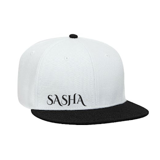
We found in our research that hats were very common merchandise. We chose to create a snapback rather than a beanie or baseball cap because they are very fashionable. We wanted this product to be quite simple and chose only to write 'Sasha' on one side of the cap, this is because we thought that it would appeal more to our target audience to be simple than very chaotic.
For our shirt we chose to use an image of our artist that we used on our digipak however we chose to add the 3D filter to it. This ensured that the shirt had an original image on it however could still be recognised as our artist and linked to the digipak. We also chose to write Sasha alongside the image so that people would know who the artist is.
Wristbands are used with most artists within our genre, we chose to use the colours black and gold like used in our digipak. We also used the quote 'Beyond imagination, Beyond Dimensions, Beyond Colour' which is used in our digipak to signify the link between the two. We ensured that this was quite simple in a bold font to draw in the audience.
Our final product was a hoodie, to link into the digipak we placed a print of angel wings onto the back of the hoodie. This was aimed to have the effect that the person wearing the hoodie would have wings to entice the target audience. It directly links to the wings that we used in the background for our digipak to create synergy.


No comments:
Post a Comment
Note: only a member of this blog may post a comment.